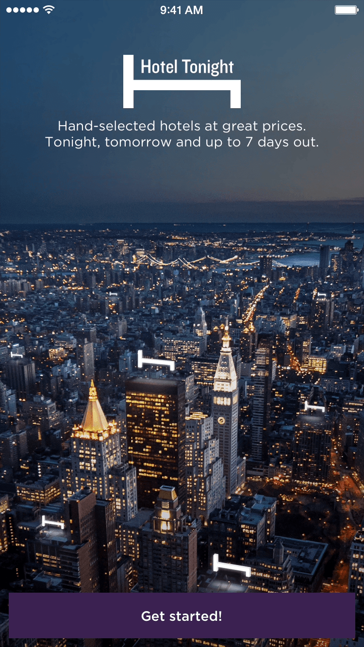
I hit the ground running when I joined Hotel Tonight. On my first day I was told I was told I had two weeks to completely redesign the iOS app and turn it from a long list to a tabbed interface! It was a great opportunity to think about creative ways to make a unique tabbed experience.
My Role
I was responsible for the
concept,
prototyping,
design,
illustration,
animation,
final spec,
asset production,
and art direction of the final shipped app.
Goals
Redesign Hotel List (main page)
Introduce tabbed interface
Design new icons
Create new visual design concept
Design cohesive swiping experience
Design new look for H Bed Logo
Work within constraints
Stay on-brand
Process
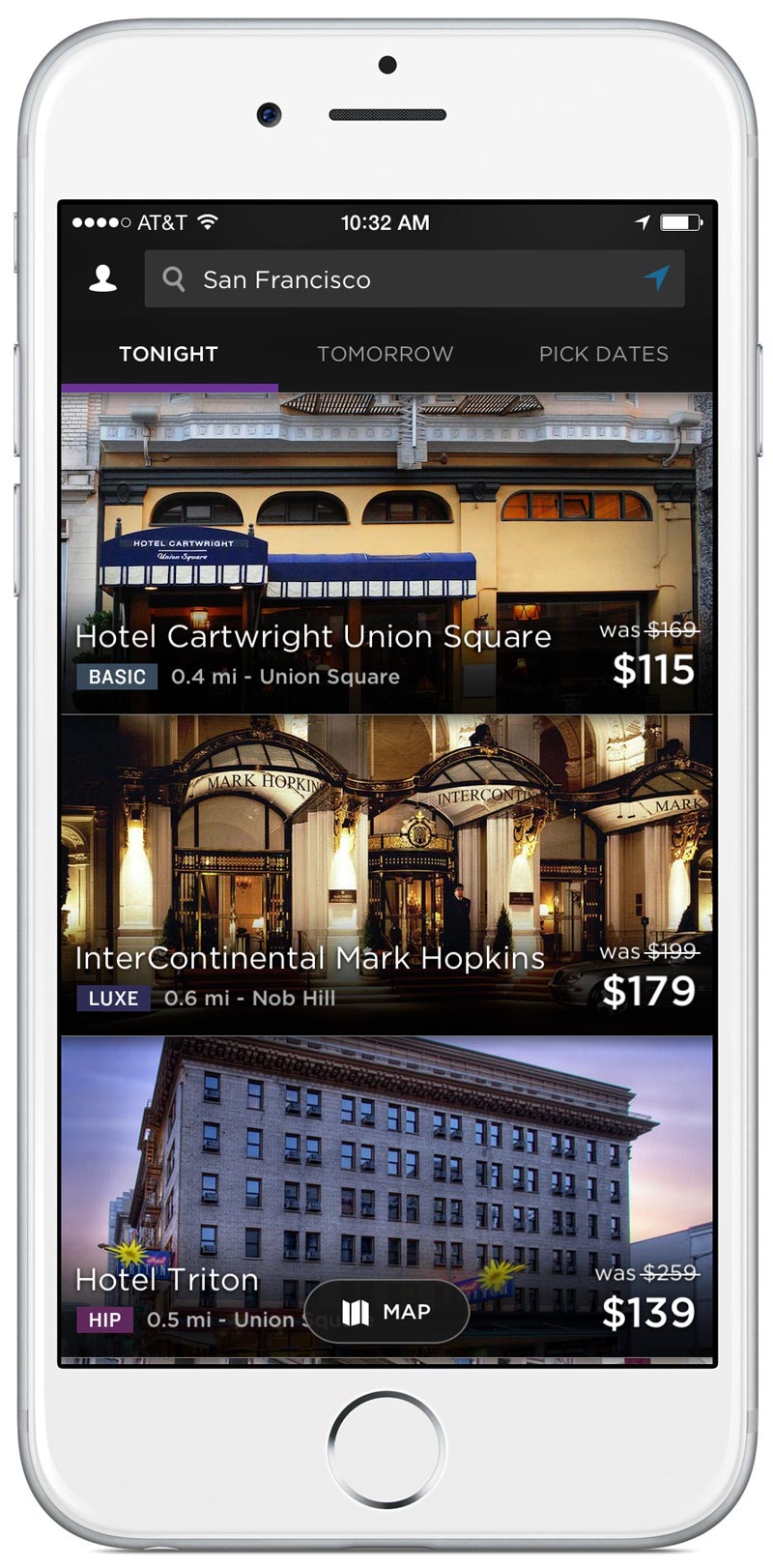
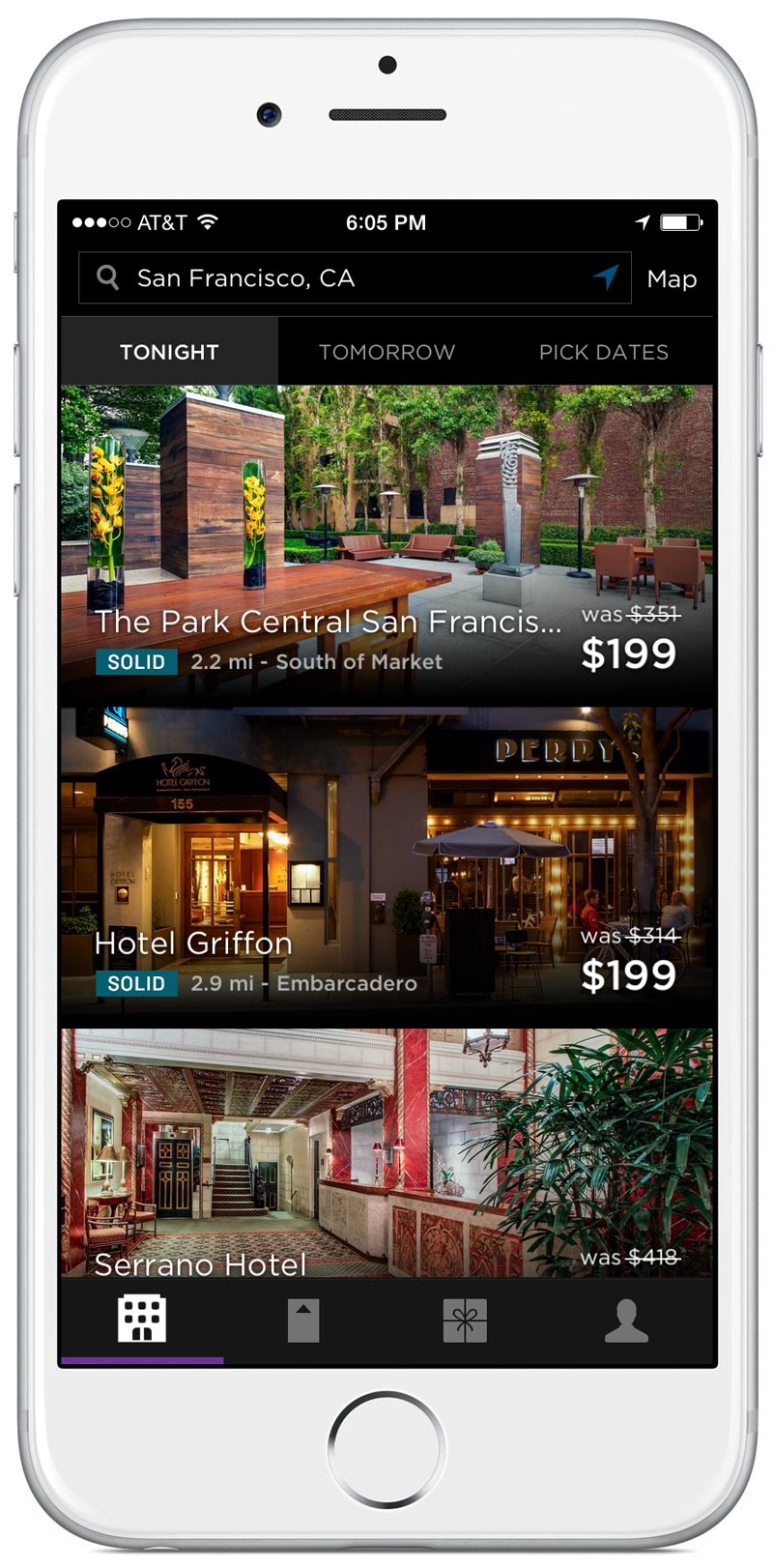
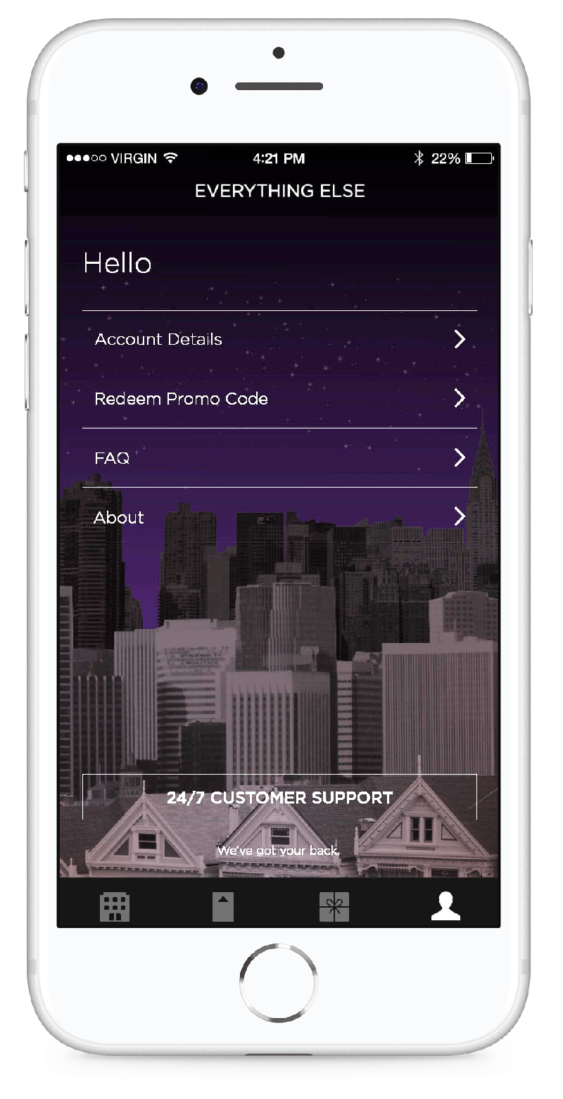
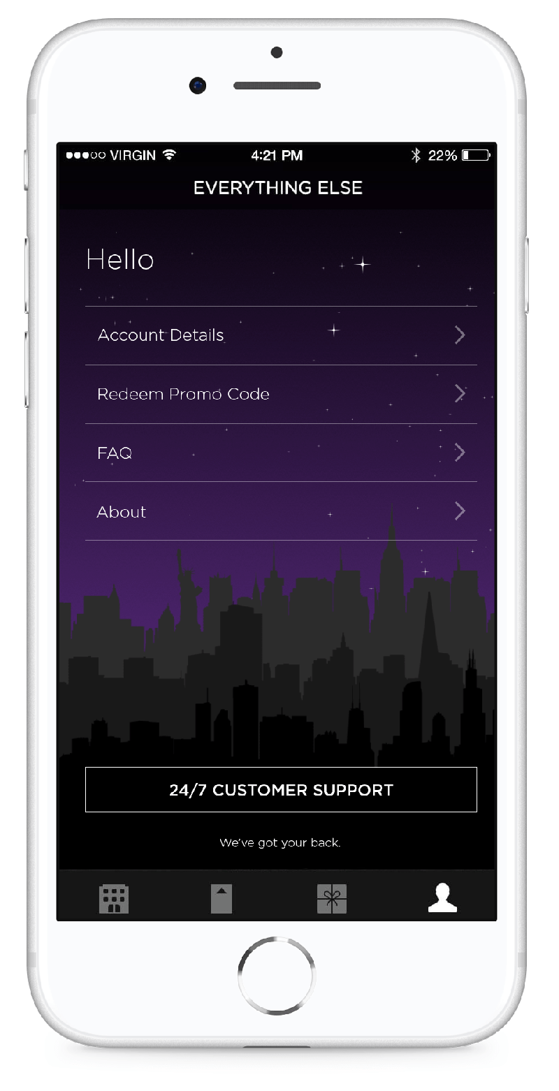
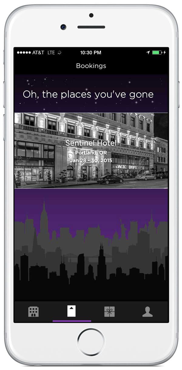
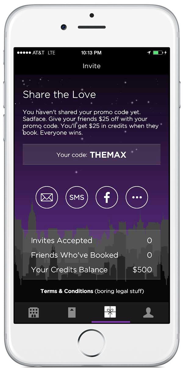
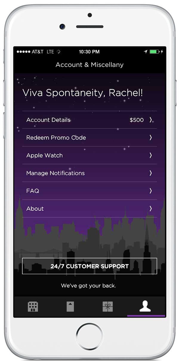
A tabbed UI was the highest priority for the update so I started with the first and most important page, the Hotel List page. Changes to the way the hotels were displayed and the structure of that information were undertaken in later update. The tabbed app redesign focused on overall interaction and top level layout changes.
I made small changes to the Search Bar design, adding a black search field with a 1px outline. That allowed for a grey highlight on the dates tab and for the purple select highlight to be moved to the new bottom tab bar.
Because the User/Settings was moved to a tab, this allowed the Map function to be moved to the top nav bar.
Adding a tabbed navigation bar helped to surface features which were previously hard to find. I designed the new tabs UI and related icons for the Hotel List page, Bookings page, Referrals page, and Account page.
Icons ideas
I designed new icons for the bottom tab bar. Here alternate icon ideas can be seen. The approved icons at this time are at the bottom of each list.
I played around with a vertical scrolling animation on the Hotel List which would show and hide some fo the UI based on scroll direction. I liked how this allowed for more of the content to be seen. After speaking to the development team, this was scrapped in order to build higher priority interaction.
Visual Concept
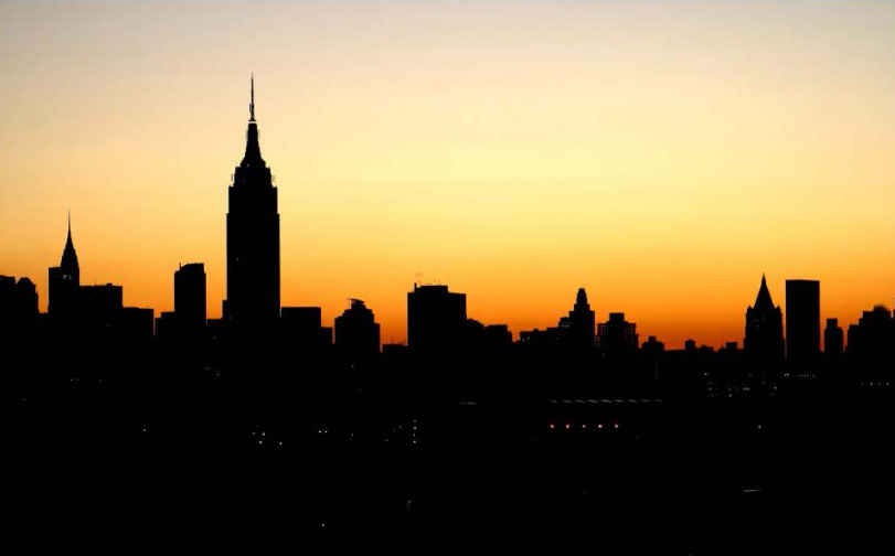
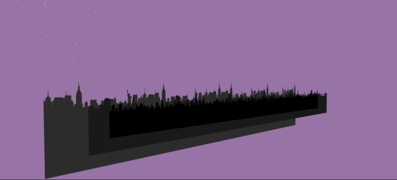
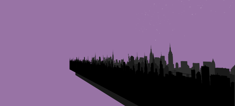
I began by thinking about the purpose of the app which was to find great last minute deals on hotels. People usually need hotels when travelling and that made me think about iconic cities and imagery.
Skylines are instantly recognizable and the Hotel Tonight app was available across the US at the time. I felt that having skylines against a branded purple Hotel Tonight background would celebrate the proliferation of the app and would celebrate the exploration of new places.
I tested several styles of cities. Made one 3D version in Cinema 4D using City Kit from Greyscalegorilla, made another with photos of cities, and made a third using flat vector city silhouettes.
The flat vector city silhouettes provided a background design without being distracting so I started experimenting with them in After Effects. I came up with the idea of using a multiplane background that would be present in each of the three added tabs.
Three city silhouettes (SF, NYC, and Chicago) could move slightly when the tabs are scrolled - the closest one moving at a faster rate than the ones behind it. Having one background behind the three tabs created a cohesive experience and the animation added discoverable playfulness.
I placed the new tabbed UI over the multiplane background to further prototype the idea.
Still images of the individual tabs over the skyline background.
The video below shows the subtly engaging scrolling experience. The parallax cityscape background features Chicago, San Francisco, and New York City and are offset in Z so they scroll at varying speeds. The stars also have a slight movement.
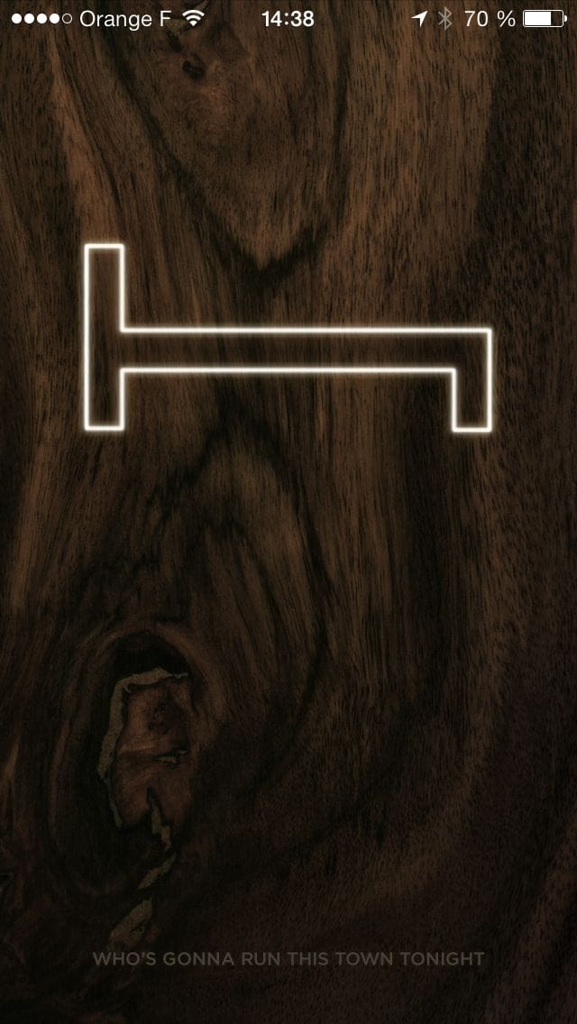
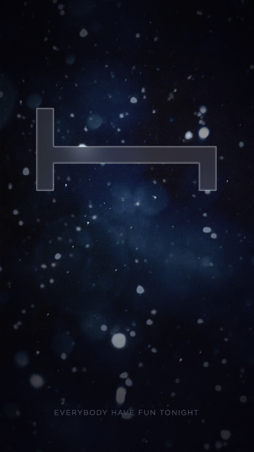
App Splash Screen
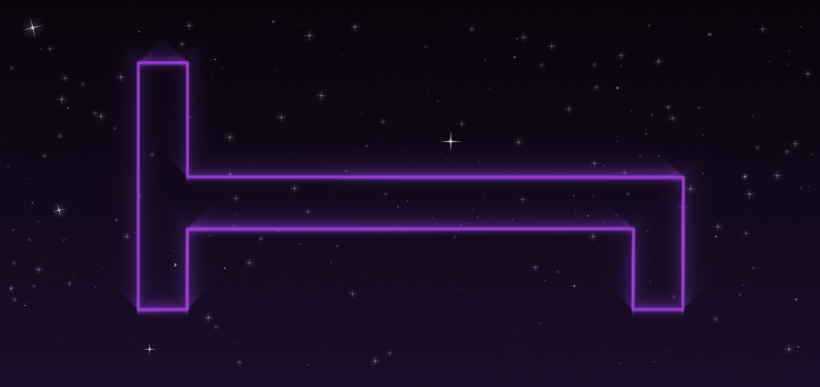
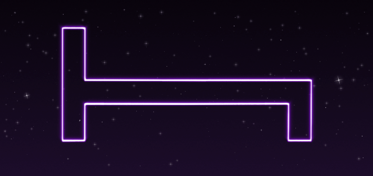
With every major update, the splash screen of the app was stylised to match the new concept. The H Bed logo had to be prominent.
Iterations of H Bed Logo revamped to match city and sky design.
The video below shows the First Time User (FTU) experience. The available hotels and new tabbed UI load over the skyline. I stylised the Hotel Tonight H-Bed logo to complement the skyline design.