The Check Out Experience on the Hotel Tonight iOS app had not been updated in years. Working with a Product Manager, we analysed where customers experienced friction and set out to modernise and improve the overall flow.
My Role
I designed the UI, the
Interaction Design, and the
overall User Experience.
Goals
To remove points of friction
To make an engaging and informative flow
To standardise input fields, fonts, buttons, and switches
To reduce to number of pages
To implement technology which enabled easier scanning and input of credit card data
Identify Friction
We began by printing out the current flow and identifying where there were issues gathered from customer data. We also identified areas where fields needed to be added or removed.
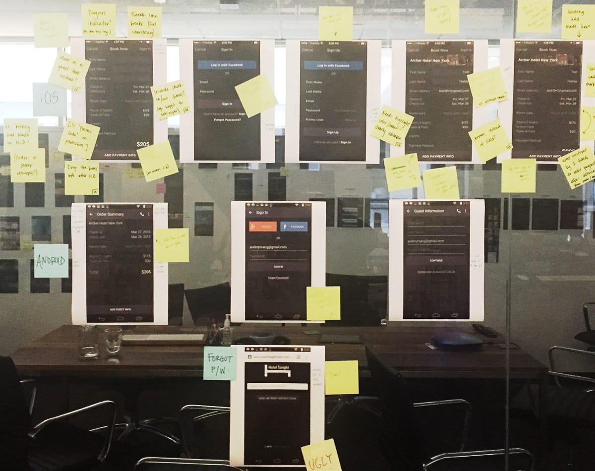
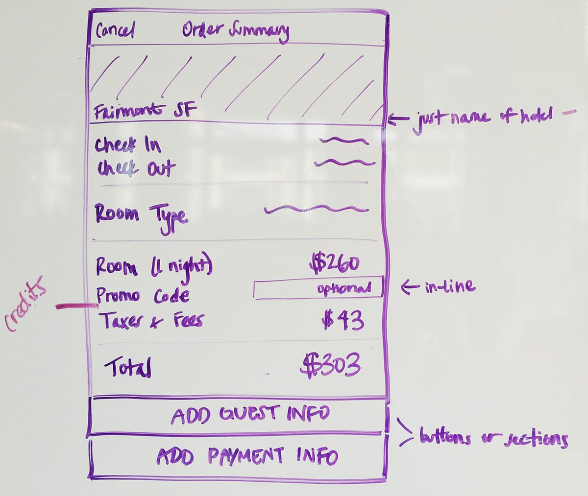
Whiteboard Design
Next we went to the whiteboards to start sketching out possible solutions.
Older Design Issues
Once a customer had selected their booking details, they were promoted to enter the check-out experience by pressing the Book Now button. A name and email were required as a first step. In this image of the older design, a Sign in button is visible on the top right but customers often missed it.
A lot of information is presented on this page and the space used for the Hotel photo is wasted real estate.
When inputting text, there was odd interaction in that the First and Last name fields were right aligned on text entry but the email address field was left aligned. Another distracting bug was that the entire page jumps when the keyboard retracts.
Older Payment Details Issues
The most important part of the check out flow that needed to be redesigned was the payment entry section. The interaction was a little frustrating as fields opened as the customer entered information. We also wanted to add support for Apple Pay.
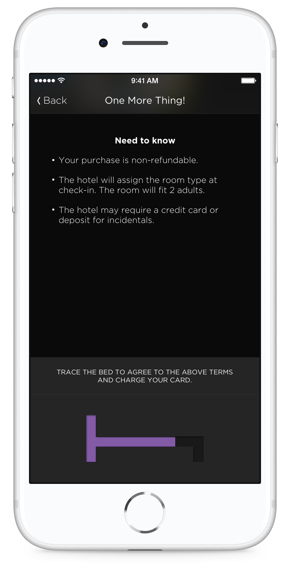
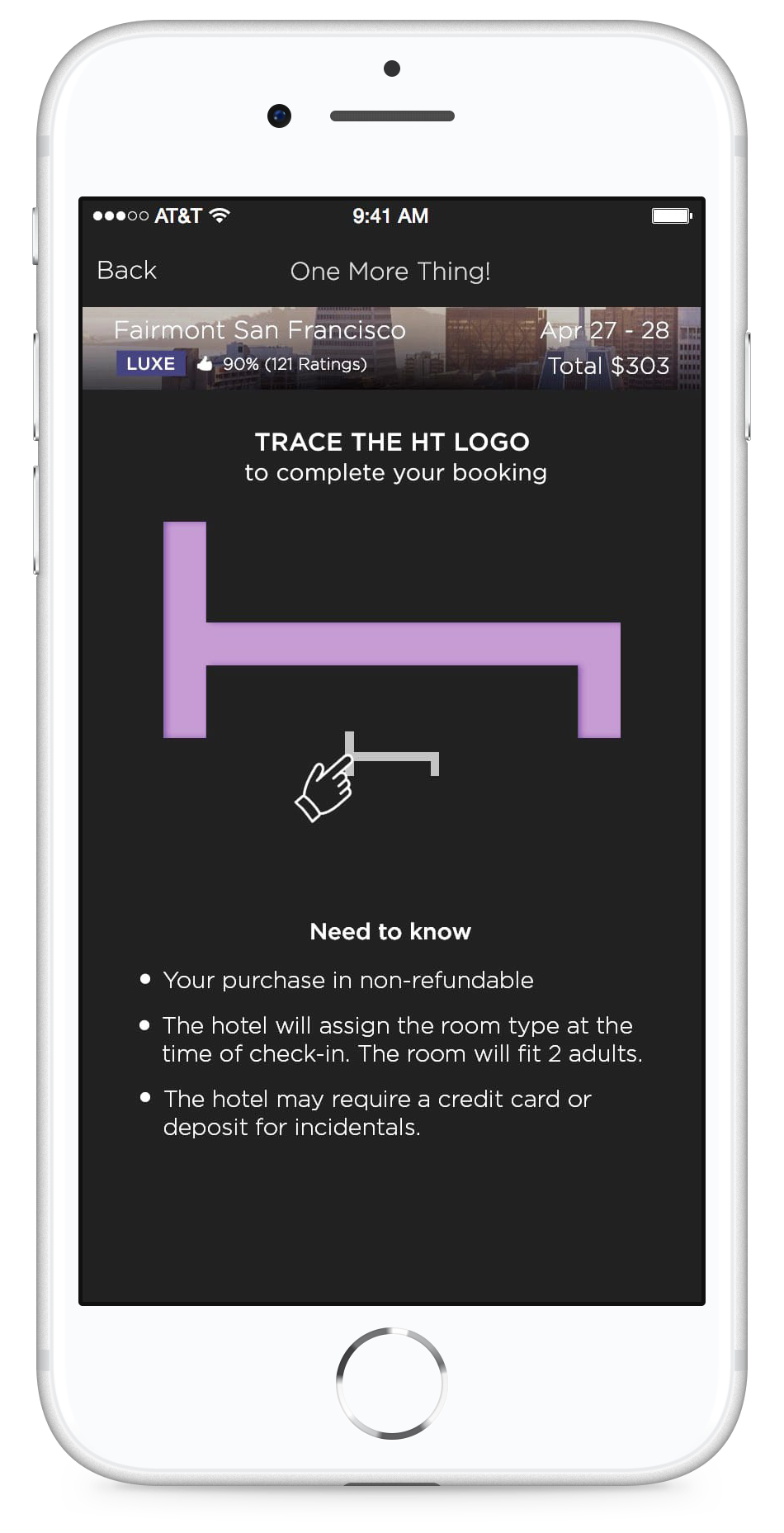
Older HT Bed Logo Animation Issues
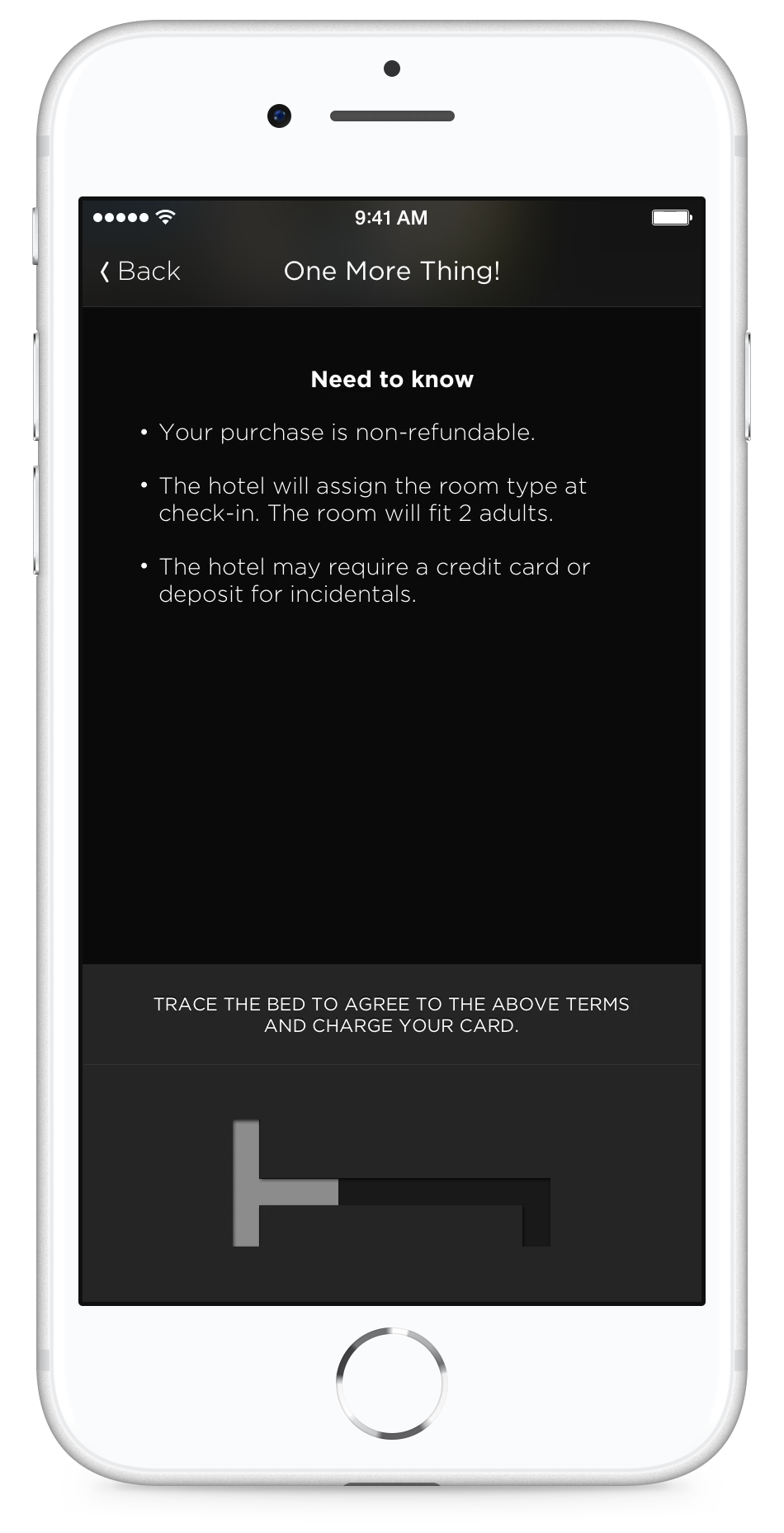
One of the points of friction came at the last step of the check out flow when customers were asked to trace the HT Bed Logo to confirm their purchase.
Tracing the HT Bed Logo was an engaging and fun idea but some customers did not understand the prompt and would leave the app without making a booking.
Tracing the HT Bed logo was important to reinforcing the brand so I began to design solutions which could communicate the desired interaction in a more comprehensive way.
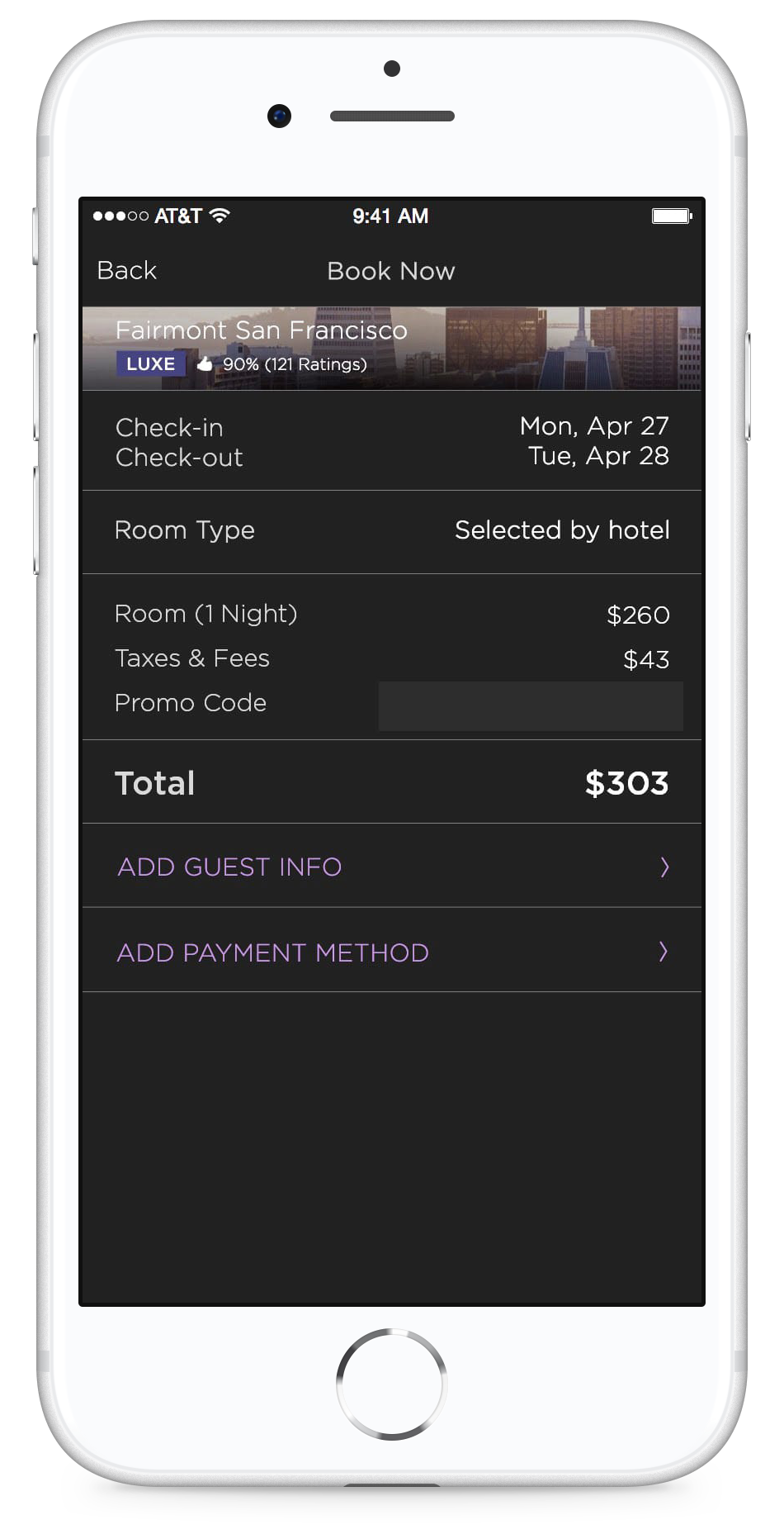
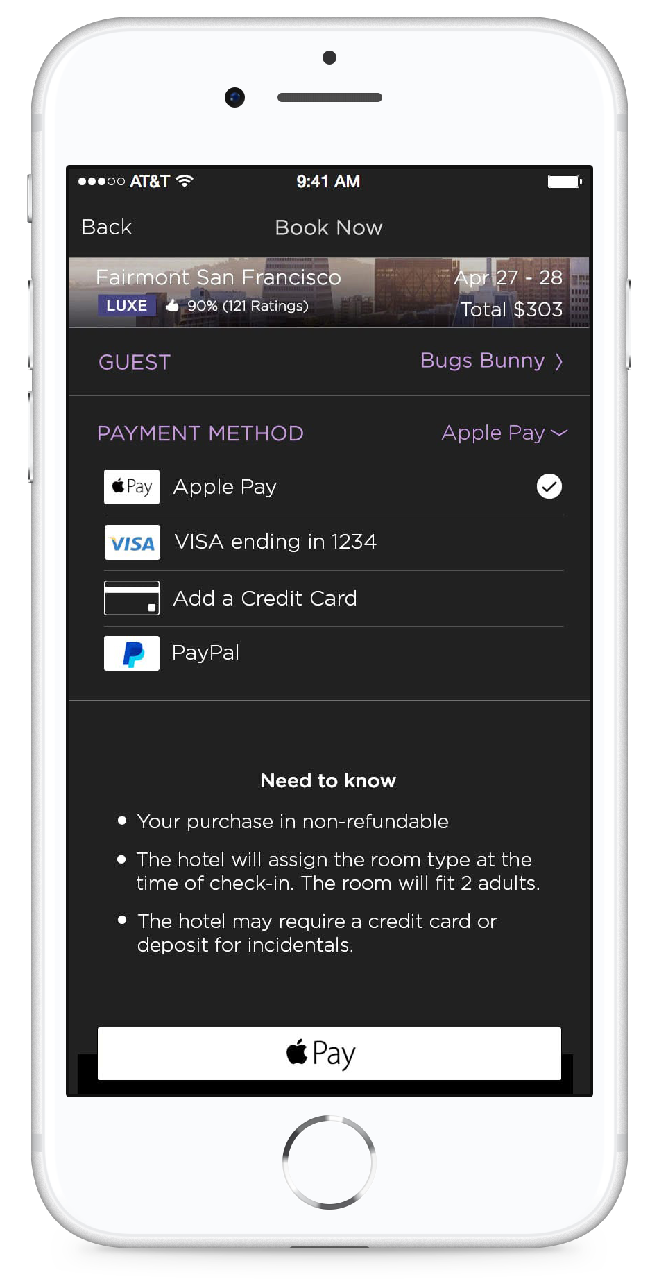
New Design
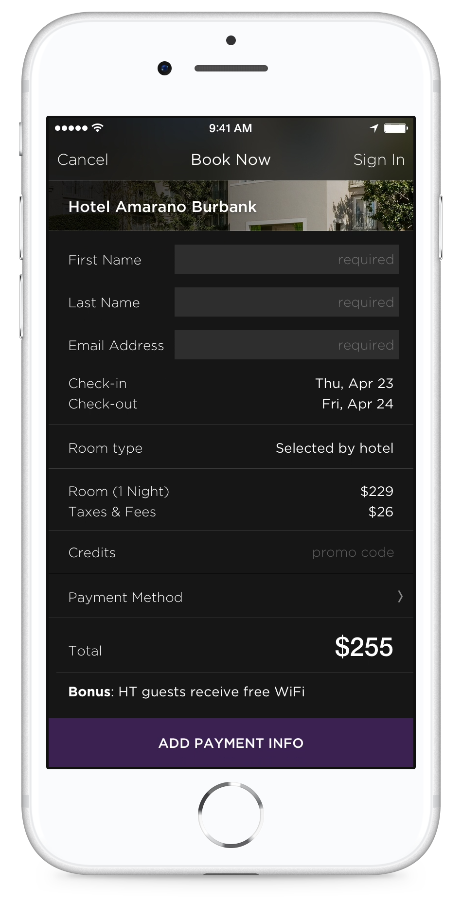
In the revamped design, the fist page list the important details. A promo field has been added for our most loyal users. And the page feels less overwhelming.
The Guest Info and Payment Methods have been consolidated as sections. The purple colour communicates action is required.
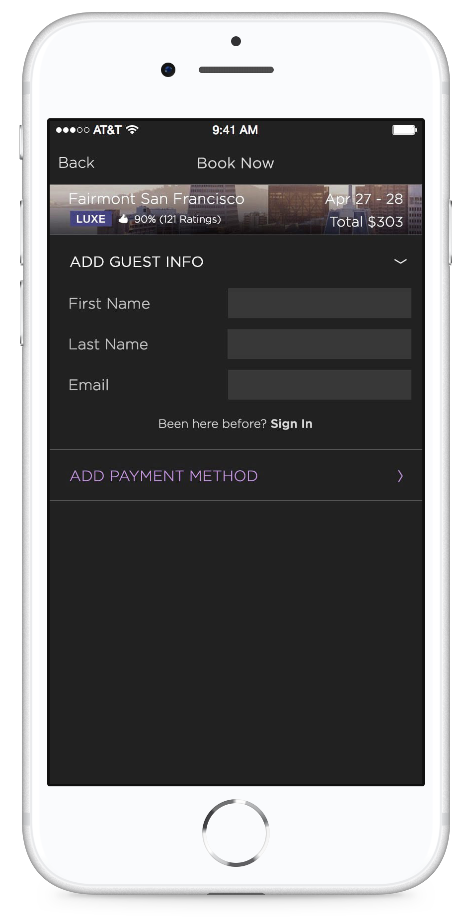
When the Add Guest Info section is selected, the secondary information animates off the page - drawing focus to the task at hand. The most important information - the dates and total appear in the Hotel photo section as a reminder of the booking.
The Sign In option is highly visible if the customer already has an account.
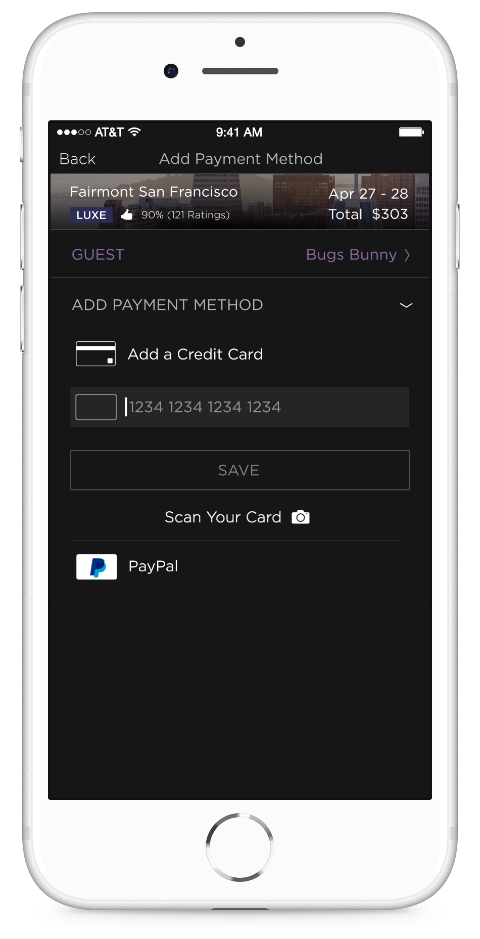
Entering Payment Details
Updating the payment method was the highest priority. The previous design was slightly clunky and we wanted to add Apple Pay functionality as well as improve the flow of adding a new credit card.
I unified the payments options with credit card shaped icons and simplified the add card input fields. Instead of unseen fields opening up as information is input, the field is static and once the information is entered it is animated out of sight.
Tracing the HT Bed Logo
I added an animation the final step of tracing the HT Bed Logo to demonstrate the desired interaction.
I moved the HT Bed Logo up on the page and made it slightly larger to make it the focus of the design.
I used Core Animator to make the hand tracing animation and was able to hand the developers an encapsulated package which included the code and the assets. Magic!
Final Check Out Experience
This video shows the final Check Out Experience with the refined features mentioned above.
Results
User testing reported highly positive feedback
Points of friction were decreased
The number of abandoned bookings dropped substantially
The time customers spent in the check out experience decreased as the flow became faster and actions were more clearly communicated