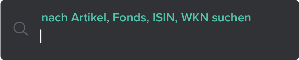
Once the new Investor Profiles and Messaging Features were built on CAPinside, it was time to redesign Search and Search Results using Algolia to upgrade search functions. Algolia offers predictive search and uses AI to deliver fast, relevant results and recommendations. Algolia also has powerful analytics which uses frequent searches and popular results to both catalog what customers are most interested in and make sure that customers were able to find what they were looking for.
Other than increasing speed, redesigning Search and Search Results allowed us to to emphasize the community aspect of CAPinside by displaying investor profiles at the top of recommendations and results.
There were two main conceptual challenges of this project: Searching - what are the interactions when a user conducts a search? Search Results - how are search results best displayed?
My Role
As Principal Product Designer, I mostly worked alone during the research and design phase (Corona Virus lockdown), checking in with the Head of Product with my findings, recommendations, ideas, and designs every few days. I was responsible for the
UX & UI design,
interaction design,
motion design,
and visual design.
I also worked closely with the development team doing design reviews and art direction to implement Search and Search Results as designed.
Tools used: Sketch for the design, Illustrator for SVG asset creation, Photoshop for image editing, and Zeplin for a smooth hand off to the development team.
Searching
There were a few use cases to consider:
1) What happens as letters are entered?
Algolia provides a super fast predictive search. We determined to use that as people typed.
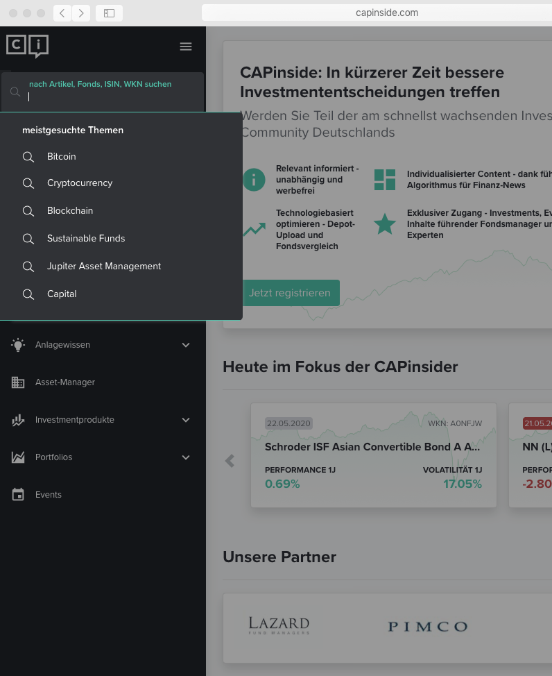
2) What happens when search is selected but no letters have been entered yet?
The Head of Product Design and I decided to follow the LinkedIn model and show search history & recommendations for popular search terms.
3) Is showing search history useful?
Searched terms are saved in order to provide faster results and in order to personalize results to align with a customer’s preferences and interests. We determined to be transparent about storing that data and to also allow a customer to delete this history.
Early Designs
At first I thought it would be a good idea to promote categories as a way to communicate the diverse content on the site. I experimented with a fly-out menu and a dropdown menu.
I was initially drawn to the fly-out menu as it felt connected to the Search field and the space of the page could be used. It would also solve for when the side navigation bar was collapsed. Here I am trying to organize results by categories with different treatments for links and category icons.
Before Text Input without Search History
The dropdown menu designs yielded better results in hallway testing so I moved forward with that method.
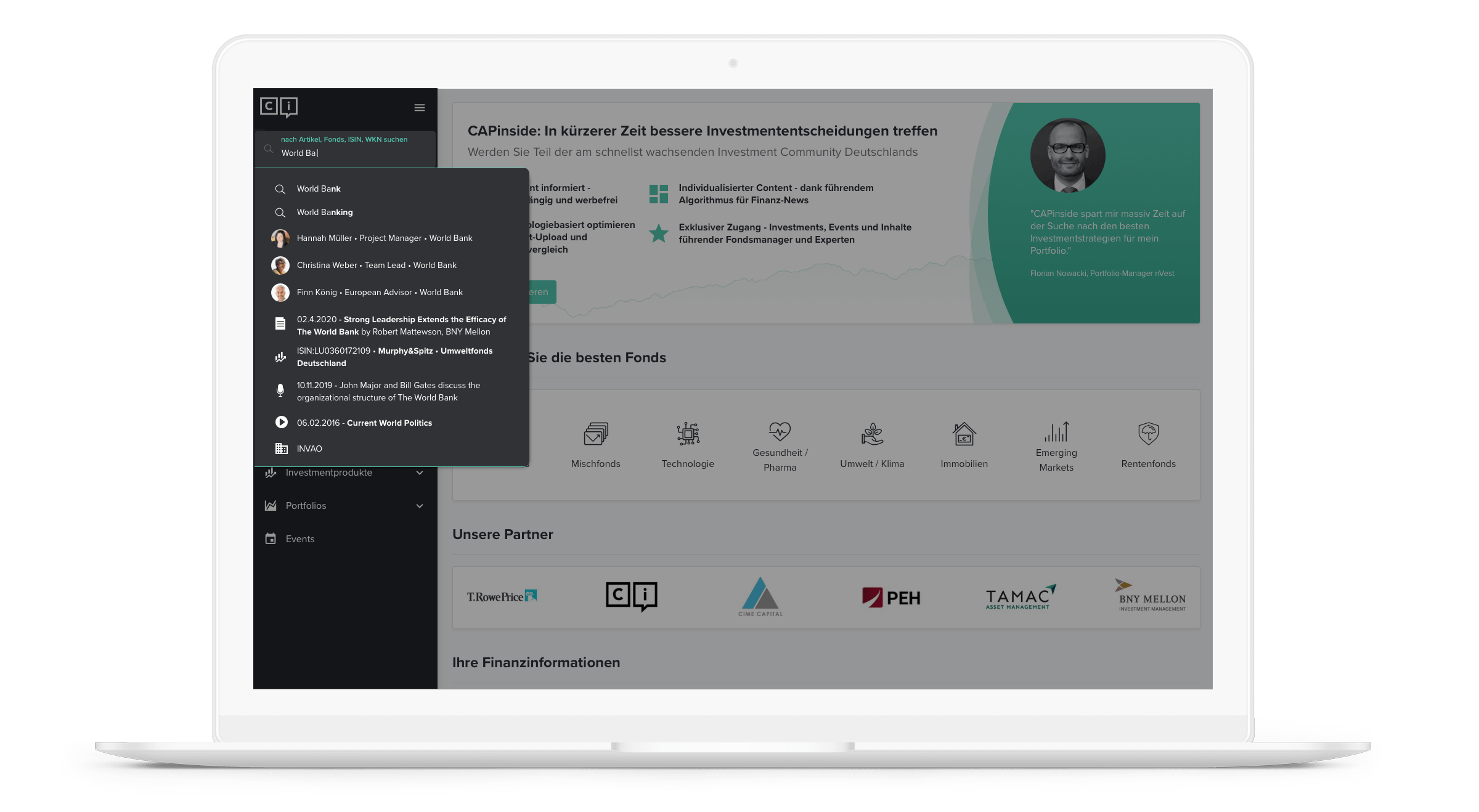
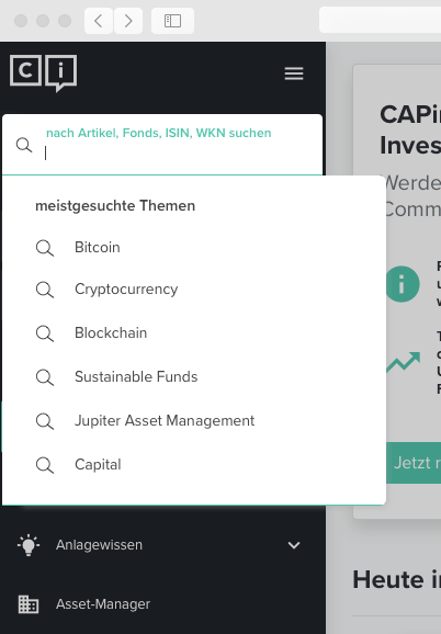
In this design there is no search history - perhaps this is the first search for this user or maybe they cleared their history. Six top trending terms are displayed which informs the user or these trends and that these topics can be searched on the platform.
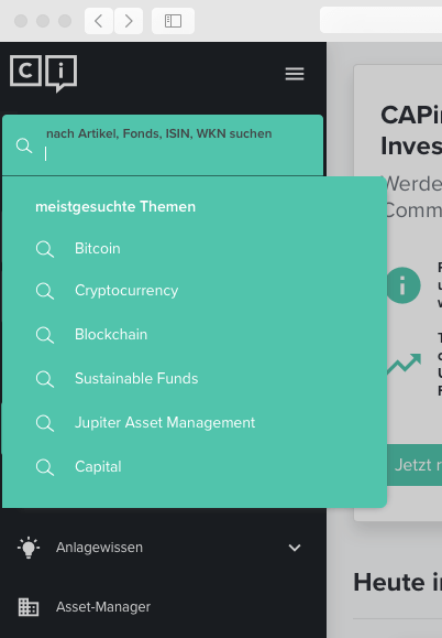
I tried the dropdown menu in other colors just to make sure the grey was the right choice and yeah, grey was the right choice 😉
Before Text Input with Search History
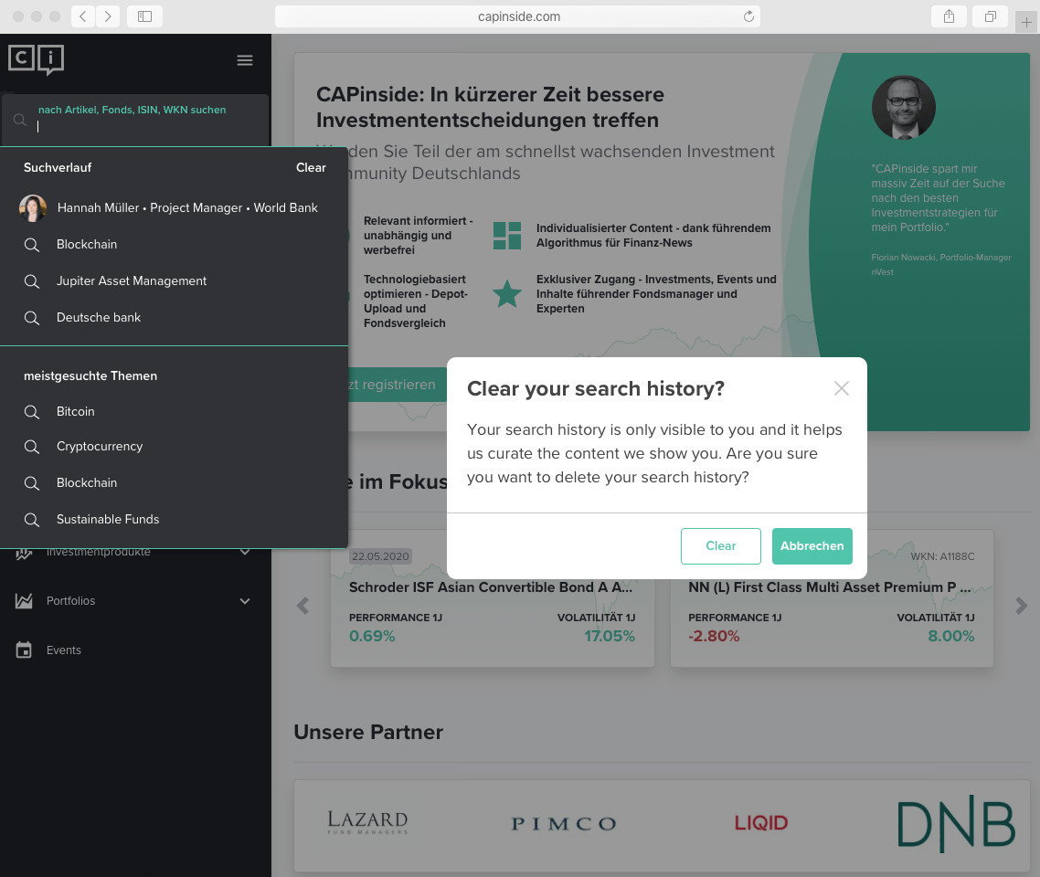
In order to accommodate search history, I reduced the number of trending topics and added four recent searches.
The option to clear the search history is easy find and when selected, prompts this modal pictured to make sure this is an intentional and deliberate action.
CAPinside uses search terms to curate content such as news articles. Erasing search history impacts the relevance of future searches and could potentially impact curated content.
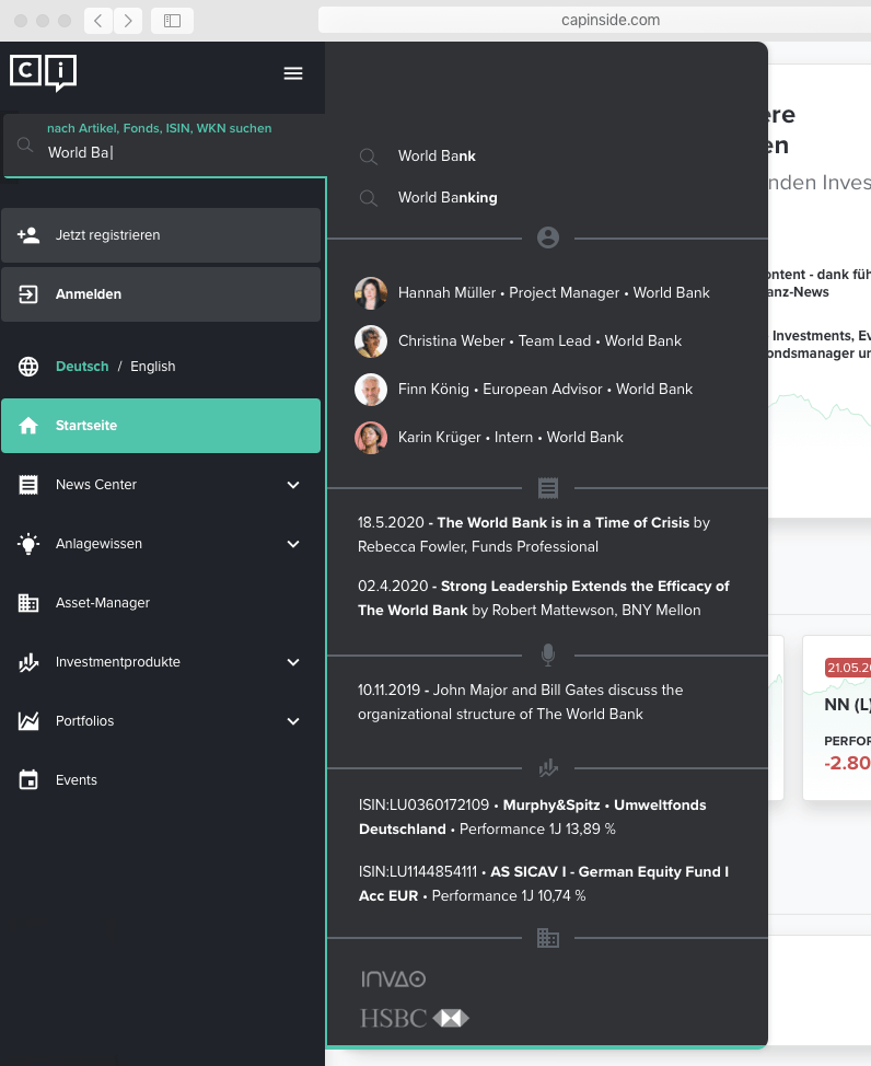
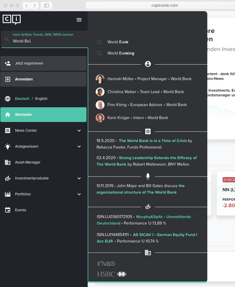
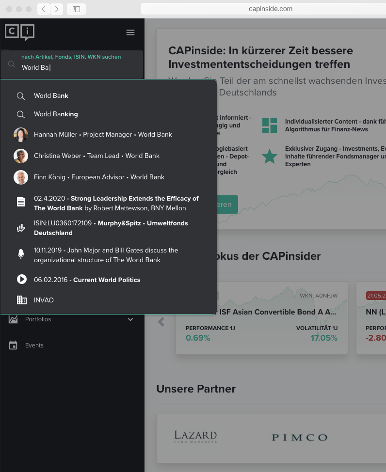
Predictive Search
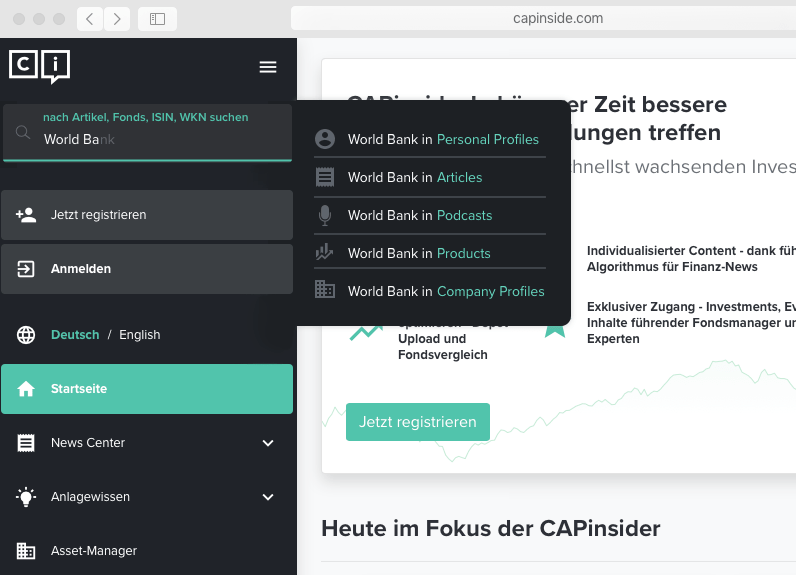
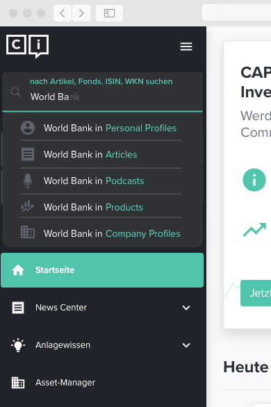
Once you start typing, predictive search offers suggestions, organized by category. The categories are limited to one or two results except for the investor profiles, which are prioritized.
We determined that limiting the search results within categories would be a good way to not overwhelm customers. I made a few new icons including the podcast, video, and article icons.
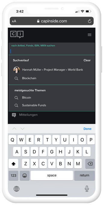
Search - Mobile
The mobile view is much the same as the web views since the dropdown is directly under the search bar.
The full width of the viewport is used in order to minimize distractions from the navigation bar. Fewer search history results and fewer suggested searches are displayed to allow room for the keyboard.
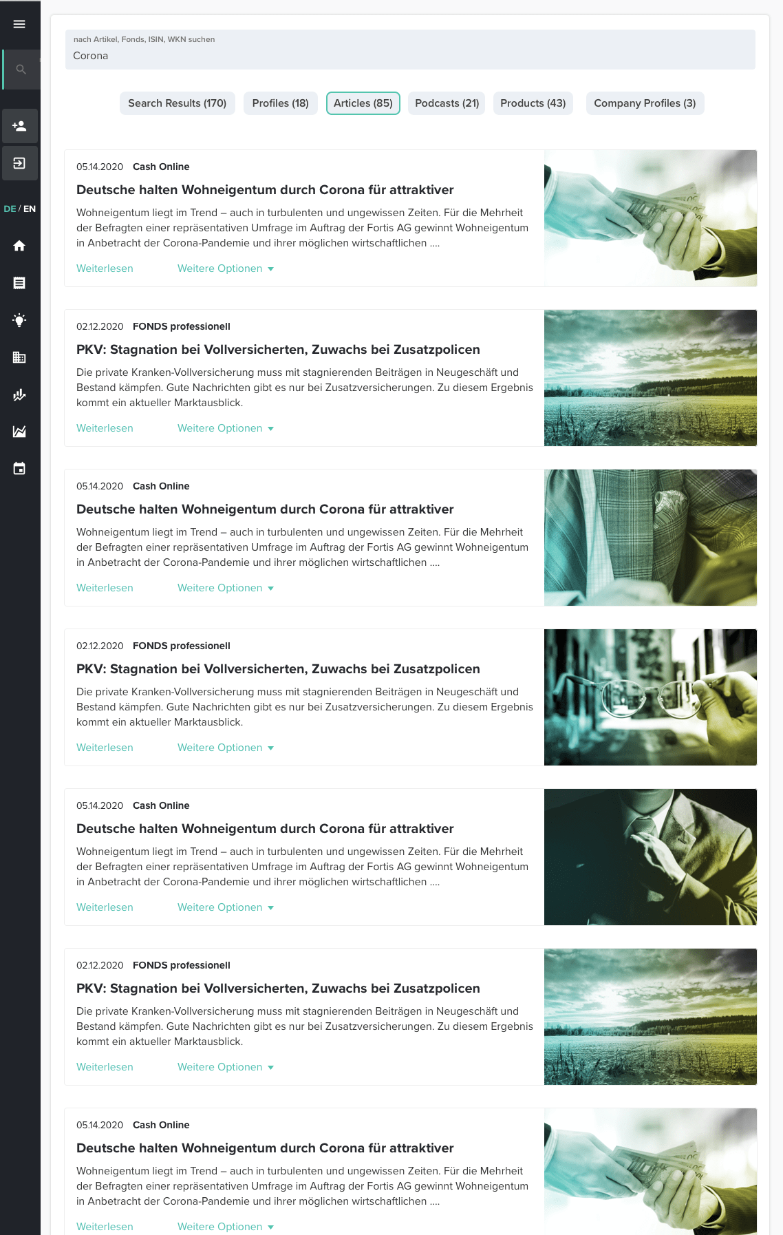
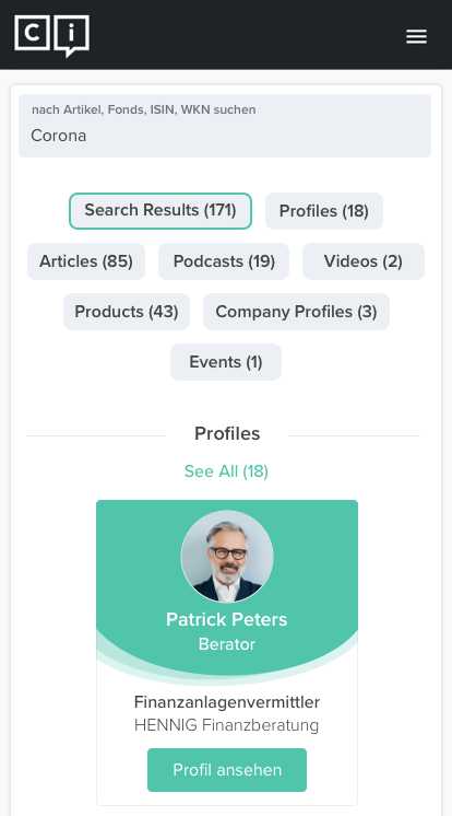
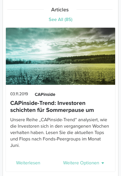
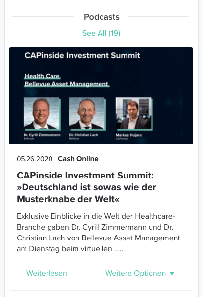
Search Results
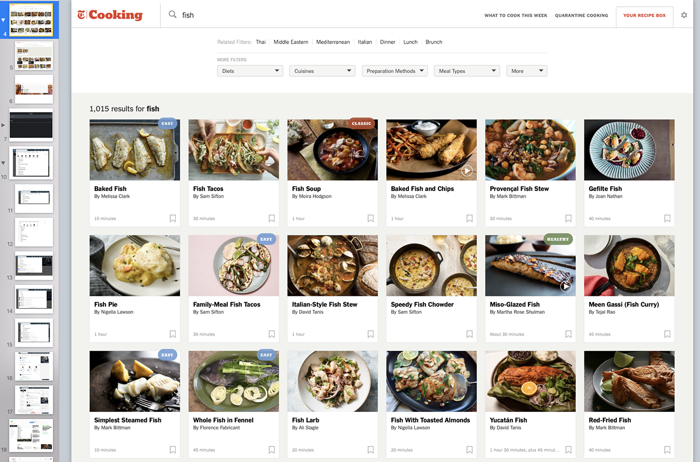
To wrap my head around this feature better, I conducted a competitive analysis to see how other platforms handle search results.
I analyzed the best performers and evaluated which of the best practices would be suited to the CAPinside search results.
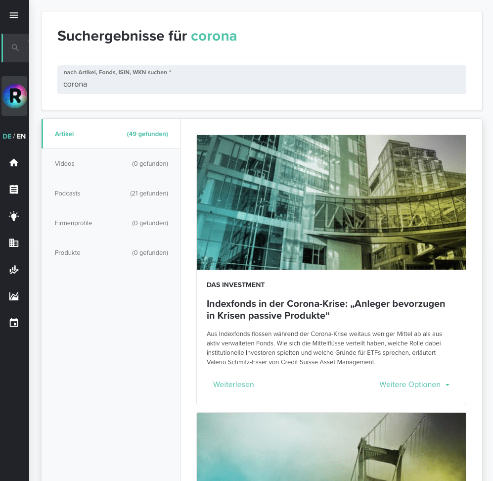
Previous Search Results
Alongside the competitive analysis I identified the friction points of the current search results. These search results provided an unsatisfactory experience. Five categories were displayed even if there were no results in a category. A value of 0 would be shown in the number of results instead of declining to show an empty category. The previews of the results were confined to a tight space due to the layout there wasn’t a lot of useful information displayed.
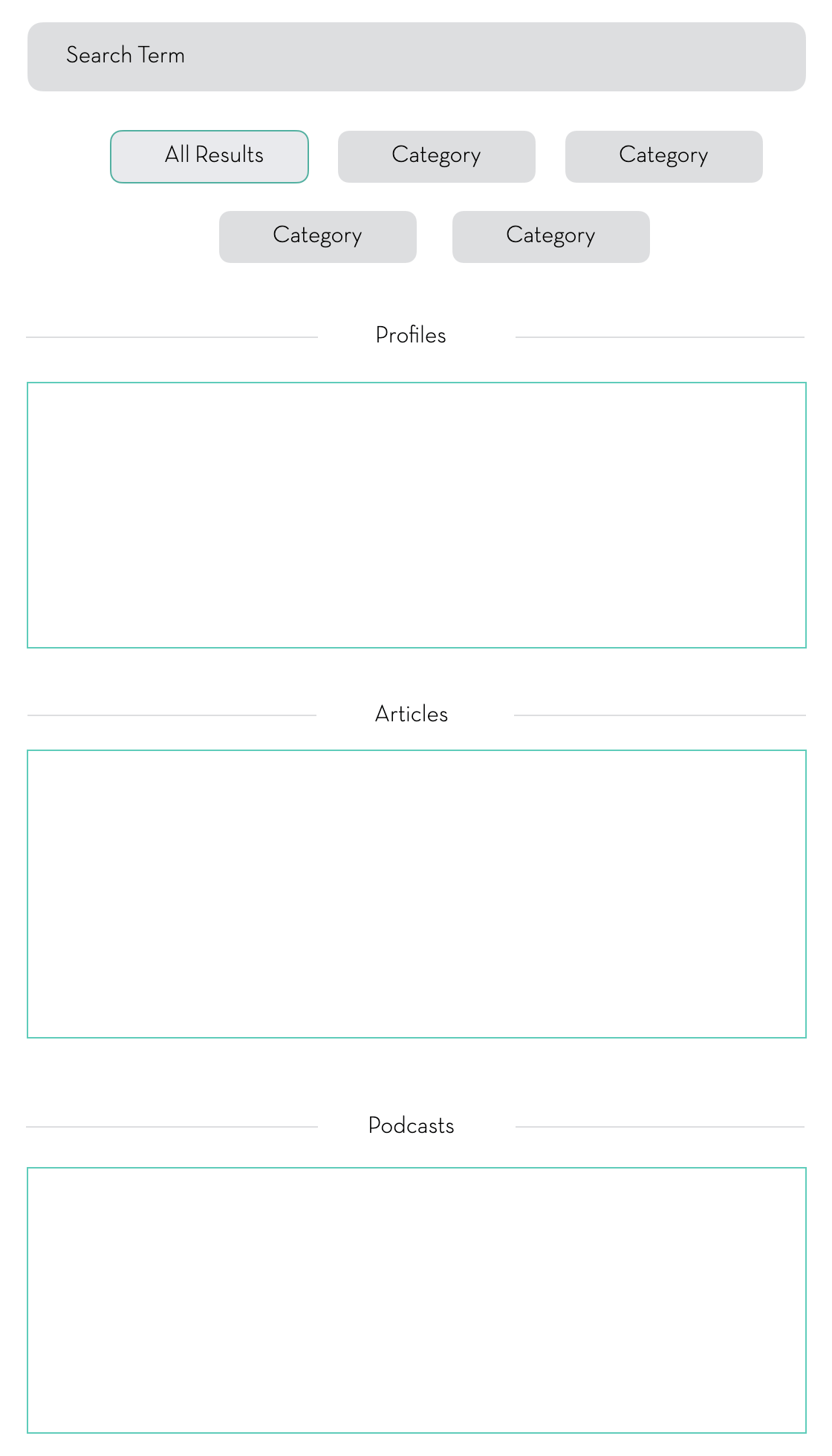
Search Results Wireframe
I knew relatively quickly that I wanted to use sections with a maximum number of results show in order to show a greater variety of search without having to scroll a lot.
Working with the Head of Product Design we prioritized the results list. These sections could be easily moved later due to their modular nature.
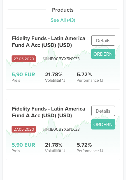
In this early design, the search results categories are text buttons. The investor profile cards are super simple and lack color. The section titles are on the left and the “see all in a category” button is below the section.
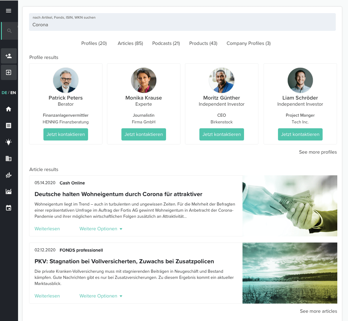
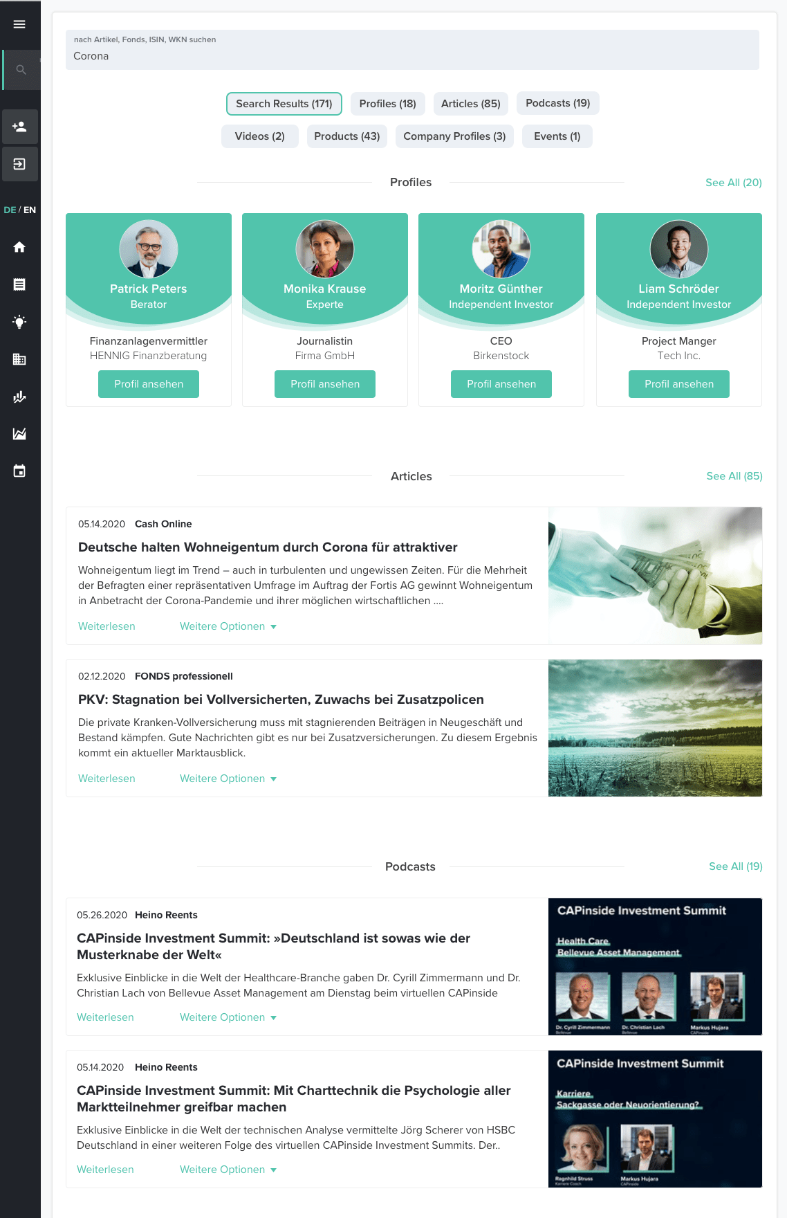
Final Design
In the final design for Search Results, the categories are more clearly defined as are the profile cards. The “see all” button has been moved above the section and is a brand green hyperlink. The section titles have been centered and made bigger and bolder.
The “All Search Results” category is selected which displays a variety of results. When a category is selected, then only those results are shown. Each section utilizes the same conical card design and layout for easier coding and visual cohesion.
(The scrollable page is divided into two parts for this portfolio. Click on the images to enlarge them.)
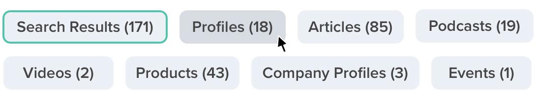
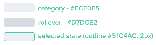
Category Button States
The search categories are interactive rollover buttons. In responsive web the rollover doesn't work in the mobile view but the selected state will display briefly being displaying the category contents. Here you can see the each of the states and the specs made for the development team.
Selected Category Examples
Search Results Mobile Design
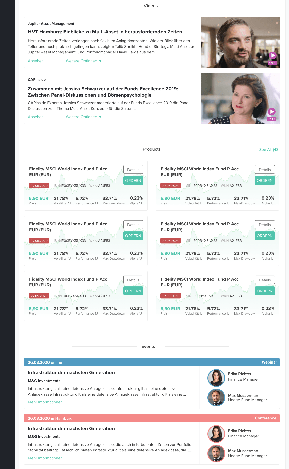
For mobile, the cards switch from landscape to portrait in order to make the best use of the format. The search results categories align to the center of the space for good balance. None of the interactions change.
Speculative Video Card Redesign
The video cards used a large play icon which obscured the content - especially faces. I speculatively designed a smaller play icon which also displayed the length of the video. It is helpful to know the length of a video before you commit.
The purple color is not a final choice but it tested best on a large number of backgrounds. I also tested a CAPinside green and a black & white version.
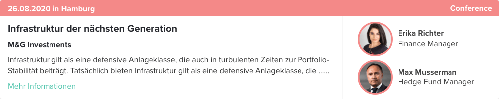
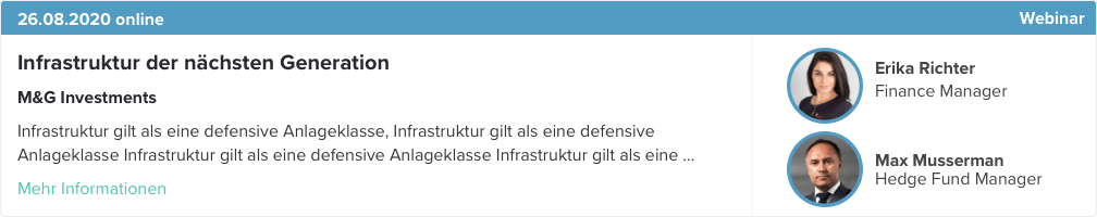
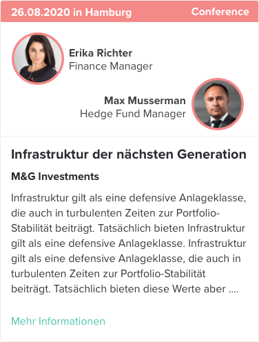
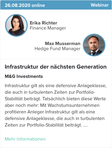
Event Tiles
Event Tiles were introduced as part of Search Results. I worked with a PO to determine that we needed two types of event cards - a live event tile such as a conference or talk and an online event such as a webinar.
Like the other cards, Events resize depending on the size of the responsive view. (If you are viewing this on a phone screen, turn it to landscape the see the wider cards.)