CAPinside is an investment community based in Hamburg, Germany where investors can communicate with one another about products, advisors can find leads, and experts can promote their skills. In order to create an online community, the second step after creating investor profiles was to add messaging to the platform.
My Role
As Principal Product Designer, I mostly worked alone during the research and design phase, checking in with the Head of Product with my findings, recommendations, ideas, and designs every few days. I was responsible for the
UX & UI design,
interaction design,
motion design,
and visual design.
I also worked closely with the development team doing design reviews and art direction to implement the messaging platform as designed.
Tools used: Sketch for the design, Illustrator for SVG asset creation, After Effects for previsualization, Photoshop for image editing, Lottie to create JSON animations, and Zeplin for a smooth hand off to the development team.
Process
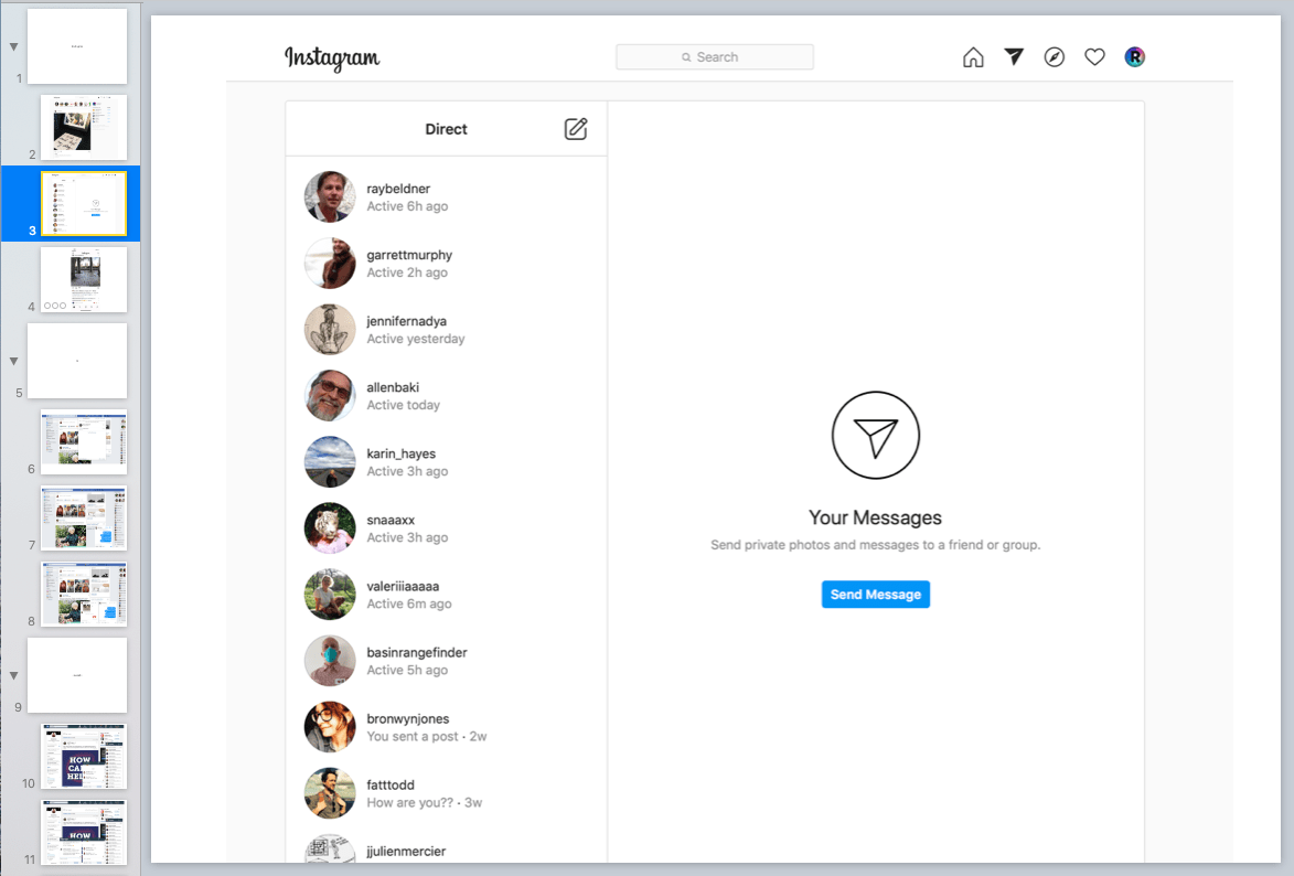
99.9% of the time I start my design process by doing visual research by analyzing similar features on different platforms. Research was especially poignant when designing such a big feature. I looked at Instagram, LinkedIn, Houzz, and GitHub to compare how browser messaging was handled and to see what features (such as edit, delete, report, and archive) were offered to users. I was drawn to the minimalist design of Instagram messaging due to its intuitiveness and ease of use. Also, the uncluttered design emphasizes the content of the communication - which the whole point of the feature!
There are lots of good tools to compile research. I currently prefer to use Keynote as you simultaneously prepare a presentation deck as well as assembling thoughts.
Early Designs
I wanted to create an unencumbered messaging page but at the time, I felt it needed to be defined by an outline - at first using the brand green and then black which was another heavily used branded color.
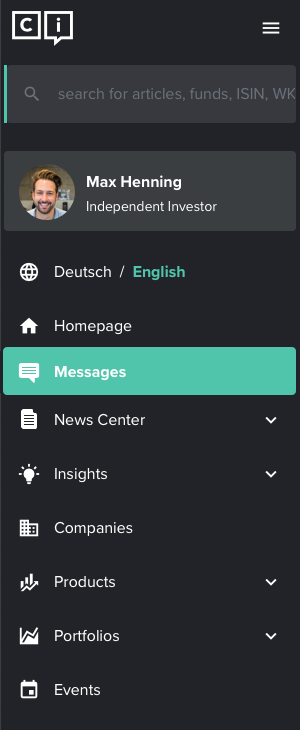
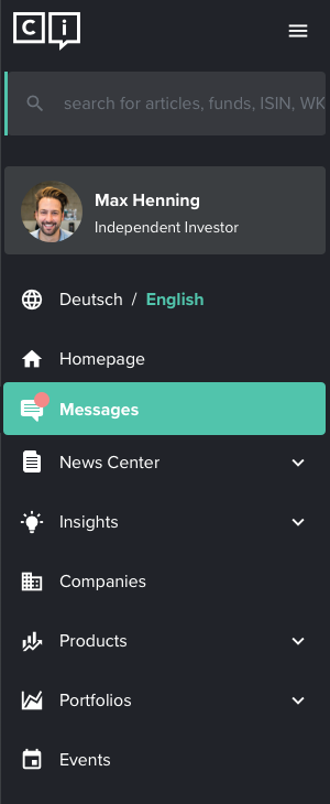
Showing active users and searching conversations were omitted for the MVP. Conversations with new messages were to be moved to the top of the chats list and an icon symbolizes unread new messages.
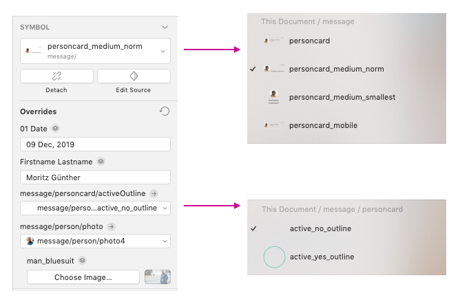
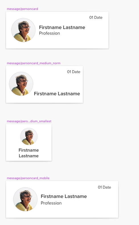
Design System Components
There was no design system at Capinside when I started so I began to create one as we augmented the investment community. I find that using components in Sketch or Figma speeds up the design process and makes it easier to hand-off to the development team. Using a Design System also builds on the brans and helps create a cohesive aesthetic. These people card components demonstrate how our responsive framework scaled. I love responsive web but it can be a challenge to consider all the states and sizes needed.
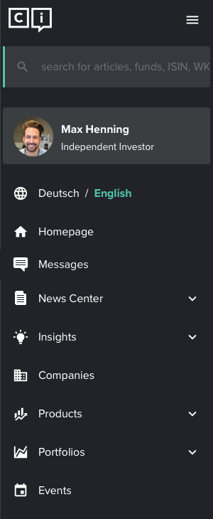
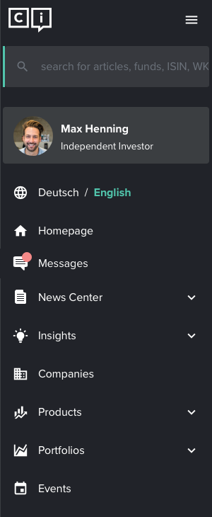
Side Navigation Bar Addition
A new messaging feature required a new page and therefore a new icon and addition to the side navigation bar. I started by designing an email icon but then determined that because this feature was intended to provide ongoing conversations, that an icon that hinted at a speech bubble would be more appropriate.
First Icon
Final Icon
+ notification
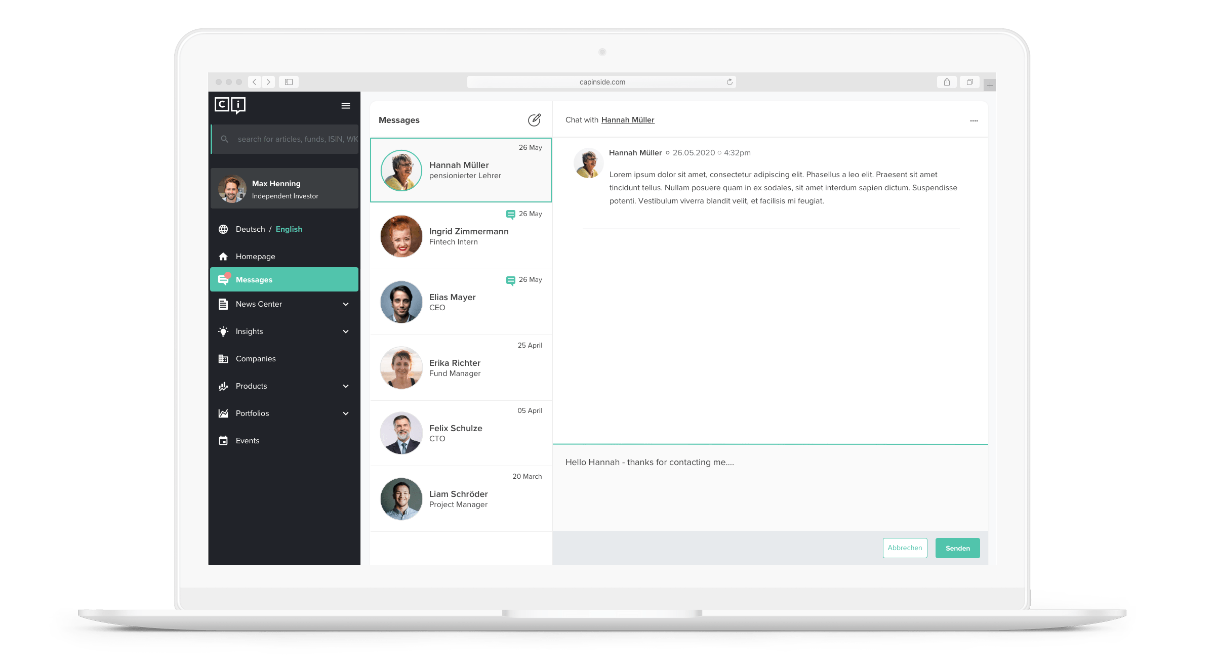
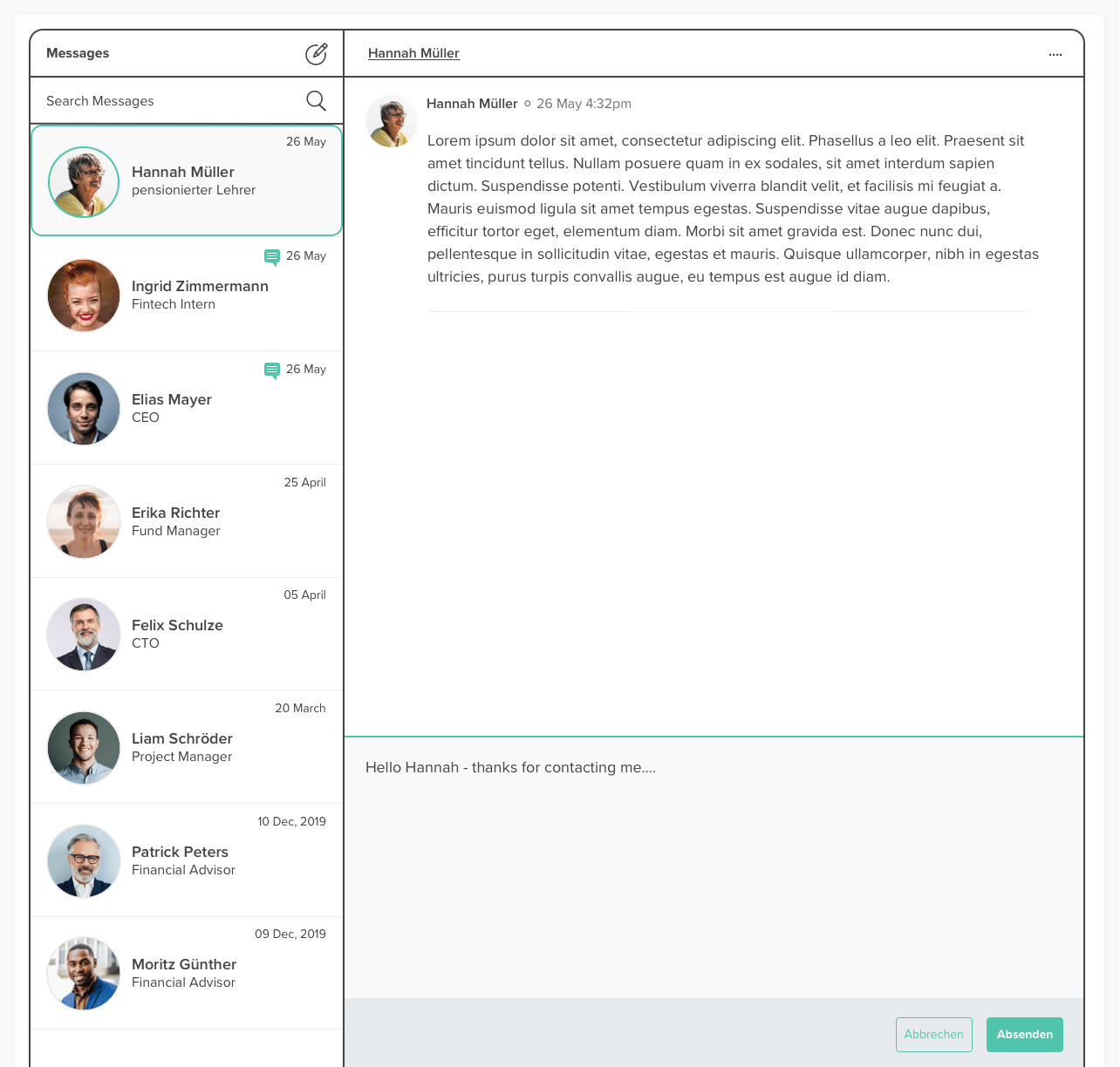
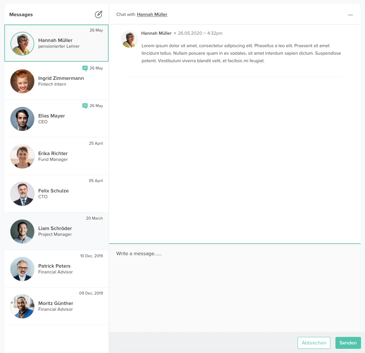
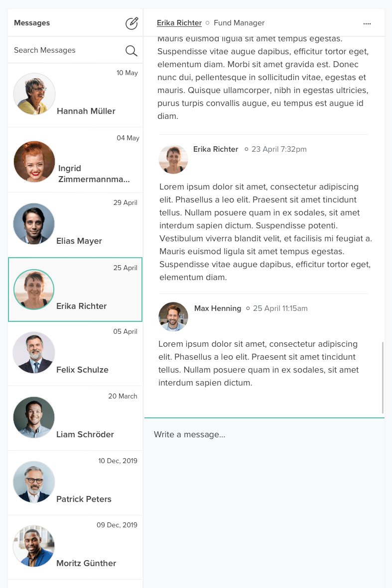
Messaging Page Final Designs
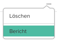
In the final design, the rounded corners and the black outline have been removed. The white background card functions as the container for the page. Clicking on the overflow brings up the delete and archive options (more options to be added in future refinements). The send and cancel button animate in once a message has been initiated but are shown here for reference.
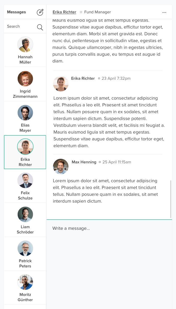
Messaging Page Medium Views
CAPinside uses a side navigation bar which can collapse and expand. Having a side navigation bar on a responsive page is complicated as browser width can change frequently. The medium states (nav bar open and nav bar collapsed) are therefore an important design consideration.
This design is for the smallest medium view if the menu bar is collapsed (having more room is not a problem).
There is still enough room for names but the titles have been moved to the top message bar. Longer names are truncated.
This design is for the smallest medium view if the side nav bar is open. People cards now only the name of the investor. Work titles and dates need to be referenced in the conversation.
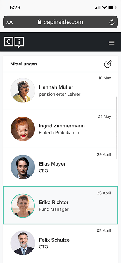
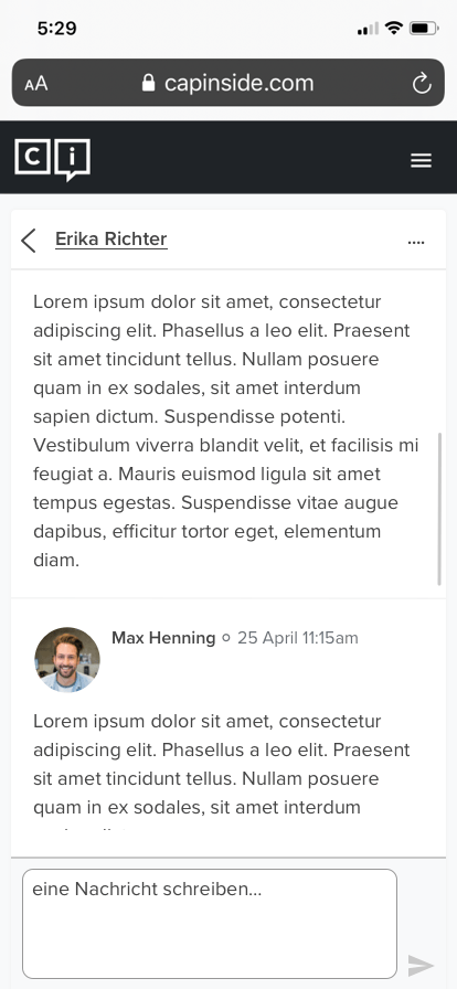
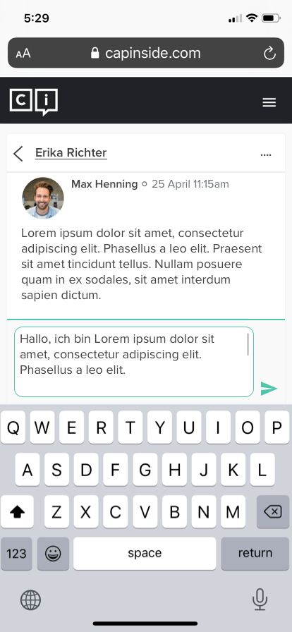
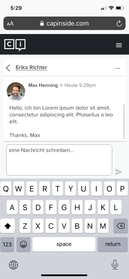
Messaging Page Mobile View
These are the four main states for mobile messaging. Selecting a contact takes you to the message history. Clicking in the ‘write message box' triggers the keyboard which pushes the messages up. After the message is sent it is added to the message history.
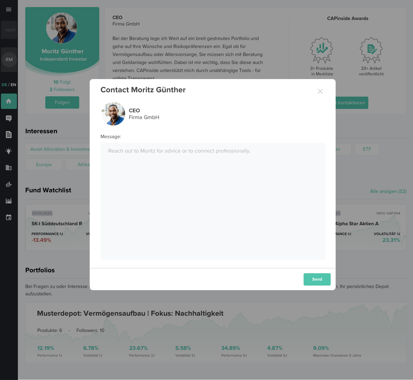
Messaging Directly from Profiles
Another way we implemented this feature was by using the new contact button from the redesigned profiles to send messages. This required a different user flow than when communicating from the dedicated Messages Page.
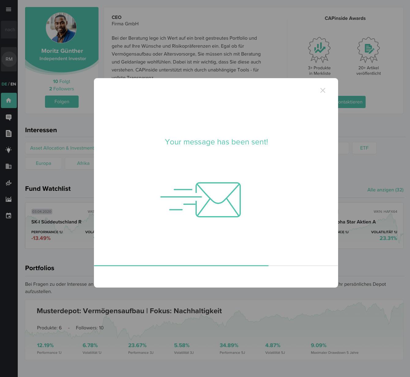
Modal Magic
I opted to use modals in this flow because they allow a new action (in this case messaging) but keep the user focused on who they are contacting. The modals allow an opportunity for a touch of animation - something to delight our customers and a chance to extend the brand with a playful touch.
Web Interaction Design
This video was made to show the flow and timing for the messaging modal. These types of prototypes help me think through the user journey and are also helpful for aligning stakeholders and developers.
Mobile Interaction Design
This video shows the messaging flow on mobile. When I was designing the profiles, I made sure to keep the contact button visible above the fold on a variety of devices. Once selected, the contact button triggers a full screen modal due to limited screen space.
Messaging from a profile is meant to be a fast way to contact another investor. Once a message is sent in this flow, the contact button reads 'contacted' and the user remains on profile. The sent message can be found on the Messages Page along with the conversation history.
I used Lottie to output small JSON files directly from After Effects for the sent confirmation animations. The developers were able to add the files directly to the codebase and we had fully functioning modal animations in a New York second.
Lottie is an incredible tool born from Design and Technologist geniuses at Airbnb. Lottie libraries and plugins are available for Web, iOS, Android, Flutter, React, React Native, Xamarin, NativeScript, Windows, Vue, Angular, QT, Skia, Framer X, Sketch, Figma & After Effects.
Would you want to code this? 😀
Results
Along with the new profiles, designing and implementing a Messaging Feature:
Allowed users to more easily engage with each other
Created increased traffic and average browsing time
Created an increase in the value proposition of the platform
Created a greater sense of community
Aligned social features with other community based sites
The customer feedback was resoundingly positive and engagement increased 30% in the first month. CAPinside was acquired!